In the world of design, accessibility isn’t just a buzzword—it’s a responsibility. The tools we use must follow suit, ensuring that everyone can engage with information seamlessly. This is the driving force behind the EasyReading font, a typeface that is not just dyslexia-friendly but universally accessible, embodying the principles of Universal Design.
We talk about the design research behind EasyReading: read on for a tour of the technical aspects behind the creation of this font.
Universal Design: The Foundation of Inclusive Communication
Universal Design is about creating products and environments that are usable by everyone, to the greatest extent possible, without the need for adaptation. EasyReading was initially conceived to support dyslexic readers, but its design has proven to be beneficial for everyone. By focusing on the needs of those with reading difficulties, we created a font that enhances readability also for all types of readers.
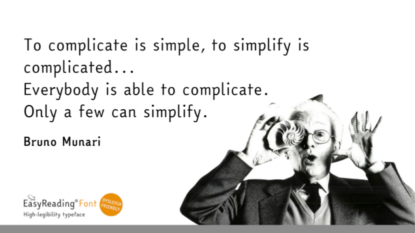
This approach is inspired by the timeless philosophy of Bruno Munari, a master of Italian design who believed that true simplicity in design is a challenging – yet essential – task. This philosophy of simplicity and clarity is at the heart of EasyReading. Each letter is meticulously crafted to be easily distinguishable, reducing the likelihood of misreading and making the reading experience smoother for everyone.
Dyslexia as a Visual Challenge and the EasyReading Solution
Dyslexia is not a matter of intelligence or psychological factors; it stems from differences in the neural processes involved in reading. For dyslexic readers, words can seem to dance on the page, and letters may appear to jump around. This visual confusion can make reading not only slower but also more tiring.
“The words seem to dance on the page” is a very frequent description of the experience of reading with dyslexia.
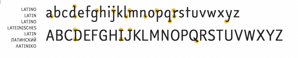
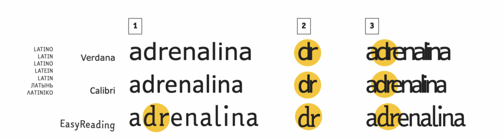
EasyReading addresses these visual challenges. One of the key issues for dyslexic readers is the confusion of letters that are similar in shape. The EasyReading font is a hybrid typeface that combines sans-serif and serif elements, specifically designed to minimize perceptual errors. For instance, the serif elements in EasyReading prevent the common misreading of similar letters, a frequent issue with traditional fonts like Lucida Sans or Calibri.
Optimized Spacing for Enhanced Readability
The font also features longer ascenders and descenders compared to other fonts, which not only aids in distinguishing between similar-looking letters, but also increases the space between lines of text. This reduces the chance of visually slipping from one line to the next, a common issue that can hinder the reading flow.
Why EasyReading Matters
The EasyReading font is more than just a tool for those with dyslexia—it’s a testament to the power of Universal Design. By simplifying and clarifying the reading experience, it makes information more accessible to everyone. As Steve Jobs, cofounder of Apple, wisely noted, “Simple can be harder than complex: You have to work hard to get your thinking clean to make it simple.” EasyReading exemplifies this mantra, proving that thoughtful design can overcome complex challenges and create solutions that benefit all.
In a world where effective communication is key, EasyReading stands out as a beacon of inclusive design. Whether you’re a designer, educator, or simply someone who values accessibility, EasyReading offers a practical, scientifically validated solution that enhances the readability of your content.
They have chosen EasyReading
Over 150 publishers around the world have already chosen EasyReading, both for the dyslexya-friendly aspect, and because they love the elegant design of the font. Among them, Amazon Kindle Italy for the self-published books and HarperCollins Publishers UK . Museums are using EasyReading as part of their accessibility measures for both permanent and temporary exhibitions, and Universities are using the font to facilitate their students’ work.
Find some examples of concrete applications of the EasyReading font, and get inspired for your next projects.
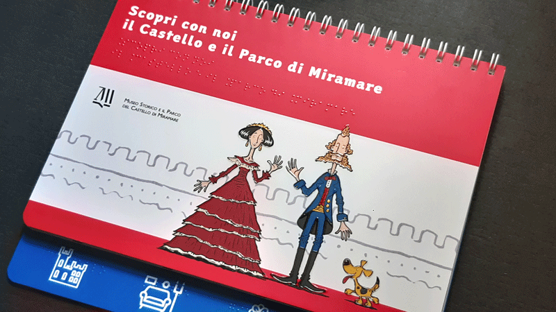
Dieci Occhi Editore, specialised in producing tactile books, has chosen the EasyReading font both for their website, and for many of their publications aimed at children and adults who are blind or partially sighted. The newest one is a charming children’s book that tells the story of the majestic Castle of Miramare, in Trieste, Italy.
“In fact, we liked this font first of all for its elegant and airy line; in terms of accessibility, then, the knowledge that it is the only font with high legibility that has been the subject of scientific research with positive judgements, convinced us definitively”. (DieciOcchi Editore)
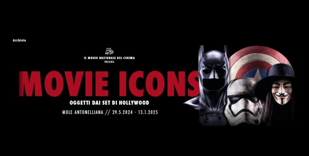
Museo Nazionale del Cinema di Torino uses EasyReading for the panels and visuals of the exhibition dedicated to objects from famous movie sets: “Movie Icons”.
Let’s embrace the simplicity and clarity of EasyReading… and make reading easier for everyone
Try out EasyReading in comparison with other fonts and tell us what you think in the comments. You can download the font for personal use for free, or buy a lifetime license to use it in your communication.