LOVELY, BUT SHOULD I TAKE IT FOR GRANTED?
We are confident and stay behind what we have said and done, yet somebody challenged us and did not take our word for it. In 2013 Prof. Christina Bachmann, psychologist and psychotherapist, conducted a scientific investigation on about 600 pupils and concluded that “…the EasyReading® font facilitates reading for both normo and dyslexic readers and can rightfully be considered a very effective compensating tool for dyslexia and a facilitating font for all readers.”
No other font in the world has been so far scientifically examined, let alone coming out with flying colours. No one, let us state it again: neither among the self-appointed ‘high legibility’ fonts, nor among the so called ‘dyslexia oriented’ fonts.
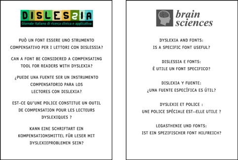
You will find reasearch here, translated into several languages.

A HIGH LEGIBILITY FONT: WHAT DOES IT MEAN?
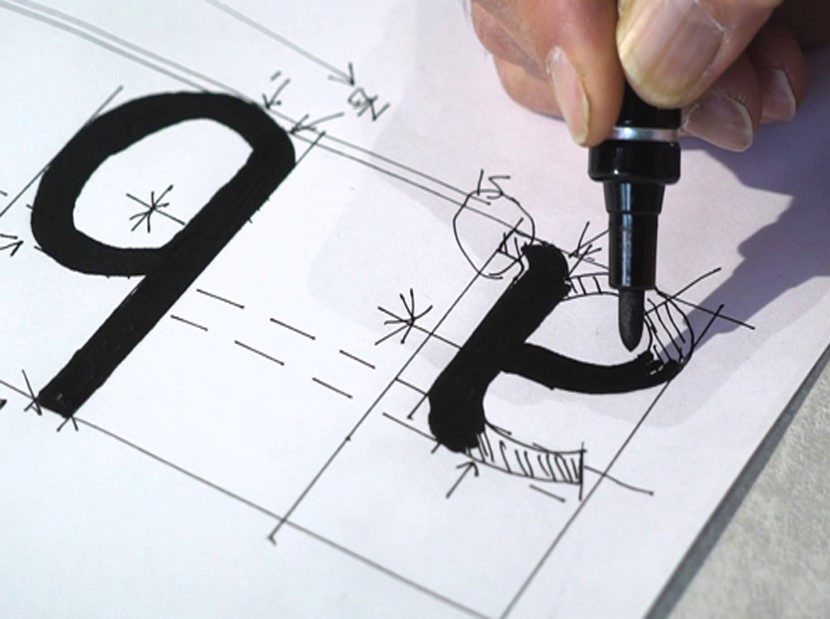
Each and every one of the over 1,900 EasyReading® characters – letters, numbers, punctuation marks, symbols, in other words all the glyphs – has been individually designed to be really easier to read. This means:
- more recognisable, because we broke the most common font symmetries and cancelled the crowding effect on purpose;
- more spaced, because, thanks to the longer than usual ascending and descending parts of the fonts, the lines in the text appear to be naturally clearly separated.
Watch the video below for a deeper insight!

The free licence is available only for private users, meant for their personal and non commercial purposes. Associations, schools, professional and companies can ask information by filling this FORM.

